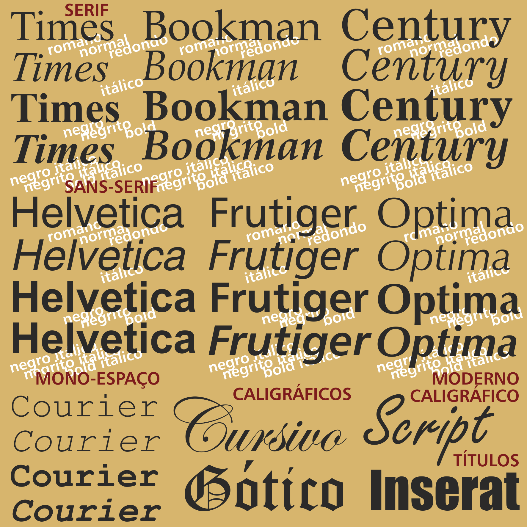
Fonts are distinguished by their visual style. On top are three common fonts with serifs. In the center, three fonts without serifs. Each one of these can be presented in the styles normal (also called Roman or round), italic, leaning forward, or bold, with thicker strokes, or a combination of two styles, the bold-italic. In modern fonts each letter has its own spacing: an m takes up much more space than an i. But single-spaced fonts, reminiscent of old typewriters, are almost always used to indicate code. In the middle, below, we have fonts that inherit the traditional calligraphy in the cursive writing, or in the gothic writing, which was the first font used, being similar to the work of the copyists.
For writing, you need letters, of course. Prior to the invention of the movable type press, writing was manual, made with a metal pen or with a duck feather. In addition to commonly used written pieces, such as notes, for which the Romans, for example, used slates, wax tablets, or papyrus, books demanded much more care and art.
They could use papyrus or parchment. This support was more expensive but it was preferred when the work was made to last. Many papyrus fragments have survived from Roman times until today, but only in extremely dry climates such as Egypt, and having been stored or hidden without manipulation all these centuries. The parchment books themselves could last for centuries, as long as they would not be used.
When writings were precious
A library of the Antiquity, such as the most famous one in Alexandria, besides keeping the books, had an army of copyists at its service, always busy making new copies of old books that got derelict by age and use, or new copies for other libraries. More rarely, they created new editions from the work of writers of the time: poets, historians, biographers, mystics. Any book copy would not last beyond a couple of centuries. The earliest editions of the Bible, for this reason, are not prior to the fourth century and are unique and precious. These are the Codex Vaticanus, housed in the Vatican Library, and the Codex Sinaiticus, with fragments scattered throughout various European capitals.
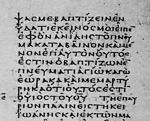
Detail of the "Codex Vaticanus", Vatican Library, Rome. Source: Bible Researcher
The richer and more educated medieval monasteries had copyist monks taking care of their libraries, working in a special room called scriptorium. Almost all of the more cherished books of Antiquity were thus preserved, but others disappeared, either by censorship or simply by lack of interest to keep on copying them.
The artists who engaged in book copying, the copyists, sought out a regular, easy-to-read style of writing. They sometimes made great illustrations on the covers, on the margins, or in the first letter of a chapter (the capitular, or drop cap), but in prose no ornaments were allowed to make reading difficult. Thus came to be the calligraphic styles, typical of certain geographical areas and historical periods. The two mentioned codices, for example, are in the uncial style: only capital letters are used and all the letters are rounded. As is typical of the time, there is no sign of punctuation, not even spaces between letters. These works are in Greek language and characters.
The print revolution
The first books printed according to the technique of Gutemberg's movable types naturally sought to imitate the work of the copyists of the time. Thus, the earliest fonts, collections of cast types, corresponded to Gothic calligraphy, which used feathers or pens front or side wise to make very thin or very bold strokes.
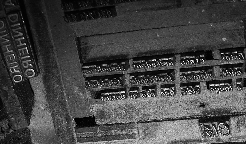
Matrix used for printing with movable metallic types. We still use this technique sporadically, when we have to print hot gold or relief.
The Renaissance soon came, with a new admiration for the aesthetics of Classical Antiquity and open contempt for Gothic art. The Italian school of Rome and Venice replaced the German and Gothic typography. These typographers admired the elegance and lightness of the Roman characters of the classical monuments, but they had a problem: they did not find a classical model for the lower case letters, since the Romans only used lower case letters for handwriting or cursive writing.
They chose another style of writing, the Carolingian (from the times of Charlemagne and his successors), mistakenly convinced that this was the original Roman style. The Latin alphabet that we use today is thus the result of the cross between Roman monumental writing for the capital letters and the Carolingian calligraphy for the lower case ones.
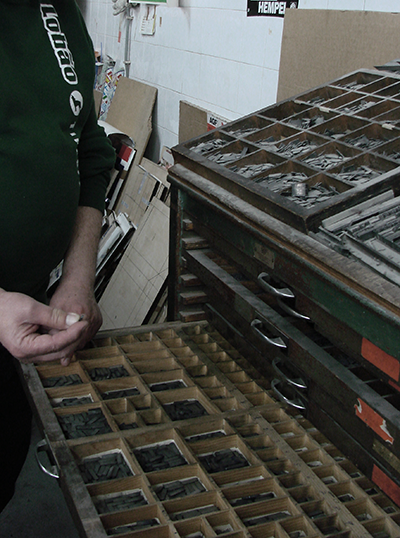
Type storage for manual type composition. Due to the wide variety of types in use, it is essential that they are neatly ranged, so that the composer can find them easily. There are drawers and compartments for each character and for the spaces.
It was to one of the pioneers typography, the Italian Aldo Manucio, that was due the invention of the italic writing, in which the characters leaned forward, so called due to the nationality of the author. In fact the italic was used throughout the text and preceded the normal or Roman type. Only later, when the two became available at the same time, was italics used to emphasize words or to indicate that a text is quoted.
The era of typography
The creators of famous types, in the following centuries, besides supplying their own printing shops, sold types to other shops, even abroad. Their names thus appear associated with some famous fonts: this is the case of Didot or Caslon.
Font was the name by which came to be known a collection of types of coordinated design, from the old French fonte, molten metal. The fonts were an important investment of the typographies, as they had to have sufficient numbers of characters to compose large works. A printing house would have to own several fonts in various sizes or bodies: in body 6 for the small print of the contracts, in body 8 for normal newspaper text, in body 10 for book, body 12 for highlights, and so on, up to the biggest newspaper headlines that could be in body 100. To replace the worn or missing types, there had to be a guarantee delivery of the same type. Hence the international importance and prestige gained by the type foundries.
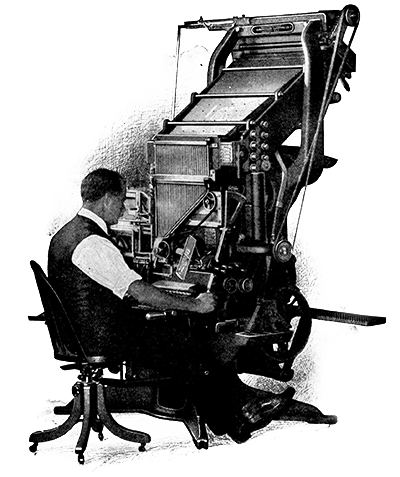
Linotype automatic composer of cast lead lines. We have never had this type of composer, since we moved from manual composition to desktop publishing. (Source: Infomercantile)
The types and graphic composition were measured with their own units, mainly the point, which roughly equates to a third of a millimeter or 1/72 of an inch. Twelve points make a pica. The point survived the decimal uniformity and even today, when one says body 12, one speaks of a text size in which the normal line is 12 points. That is, 4.233 mm, or a sixth of an inch*.
Industrial Revolution
And computer revolution
The Gutemberg press revolutionized communication, making the high-volume book, the newspaper, and the pamphlet possible, which are the basis of public opinion, a fundamental component of modern liberal democracies.
At the end of the nineteenth century appeared automatic machines to compose in lead, Monotype and Linotype, which greatly increased the capacity of the press.
But it was in the late twentieth century that the computer revolution turned the art of composition upside down. The fonts ceased to be physical objects and became digital files on computers. Each letter can then be repeated an infinite number of times, reduced and enlarged, distorted and pass through a number of transformations made possible by its new immateriality.
Virtually all the fonts that have existed throughout history are now available to every graphic designer, first for a modest price, but increasingly free of charge. Thousands of new fonts have been created, both by traditional foundries, now digital creators, and by independent and curious artists.
This embaras de richesse greatly facilitates the work of the graphic designer, but it creates a number of new pitfalls. With so much freedom, it is easy to forget that the function of text is to communicate ideas. Graphic creation must not fail to be humble, contributing to the success of communication without creating obstacles to reading.